


A design system provides reusable foundations, components, guidelines, and documentation that can help a team build more consistent interfaces. It can reduce duplicated design decisions and repeated implementation work across a product.
Building and maintaining that system is not free. Foundations need defining, components need building and documenting, and all of it needs to stay current as the product changes. That ongoing effort does not disappear once the first version ships.
Because of that trade-off, the useful question is rarely “Should every product have a design system?” A more practical question is: how much design-system investment does this product actually need? The answer depends on the product, the team, and how both are expected to change.
1. What Is a Design System?
“Design system,” “component library,” “pattern library,” and “style guide” are often used interchangeably, but they describe different levels of scope.
- Style guide: visual rules such as color, typography, and logo usage, usually without functioning code.
- Pattern library: recurring UI patterns and layout conventions, typically documented for designers.
- Component library: reusable, coded UI components (buttons, inputs, modals) developers can implement directly.
- Design system: a broader collection that can include design principles, foundations, design tokens, a component library, interaction patterns, accessibility guidance, content guidance, and implementation documentation, tied together by shared decisions and governance.
The Atlassian Design System reflects this broader scope, combining guidelines, principles, and reusable components meant to help teams build consistent, accessible products. A design system is more than a collection of UI screenshots — it is a working set of decisions, assets, and documentation a team actively uses and maintains.
2. What Problem Does a Design System Solve?
Design systems are typically adopted to address recurring, practical problems, including:
- Inconsistent UI: the same element is styled or behaves differently across a product.
- Duplicated design decisions: the same spacing, color, or behavior choice gets re-decided.
- Duplicated implementation work: similar components get rebuilt separately.
- Unclear design rules: no documented source of truth.
- Inconsistent accessibility patterns across screens.
- Difficult design/development collaboration during handoff.
- Slower onboarding for new team members.
- Repeated changes across screens that must be made manually in many places.
Not every product experiences all of these, and not every problem requires a full design system. Identifying which issues genuinely exist is a better starting point than adopting a design system as a default practice.
3. When a Design System Starts Providing More Value
A design system tends to provide more value as conditions like these accumulate:
- Multiple designers and developers contribute to the same product, raising the risk of inconsistent decisions.
- The product contains many repeated interface patterns, such as forms, cards, or navigation used across sections.
- Several products or platforms need to share visual or interaction patterns.
- The product is expected to evolve continuously rather than stay static after launch.
- Teams need documented decisions so choices aren't re-argued each time a pattern is used.
- Accessibility requirements need to be applied consistently across many components.
- The same components are already being implemented separately, indicating duplicated effort.
These are contributing factors, not fixed triggers. There is no specific number of people, screens, or products at which a design system becomes necessary — it depends on how many of these conditions apply, and how strongly, to a given product and team.
4. When a Full Design System May Be Unnecessary
A comprehensive design system can be disproportionate when:
- The project is very small, with a limited interface and no planned expansion.
- The interface has few genuinely repeated patterns.
- The product is still validating basic direction, so the interface may change substantially.
- Little future development is expected beyond current scope.
- The team would spend more time on documentation than it gains back through reuse.
This doesn't mean small projects should avoid design systems entirely. A lightweight set of shared foundations and components — typography, color, spacing, and a few base components — can still reduce inconsistency and rework, without the governance depth of a mature system.
5. The Middle Ground: Start Small
Between no shared system and a fully governed one, many teams start with a lightweight set covering only what's actually reused:
- Typography rules
- A defined color palette
- Spacing values used consistently across layouts
- Buttons
- Form controls
- Cards
- Navigation patterns
- Basic accessibility rules (focus states, labeling conventions)
- Design tokens where they simplify maintenance
- Lightweight documentation for each component
This can expand as repeated needs emerge — for example, when a second product launches, or the same custom component keeps being rebuilt. It's one practical approach, not a universally correct starting size for every team.
6. Design Tokens and Foundations
Design tokens are named values representing core design decisions — color, spacing, typography, border radius, elevation — stored as variables rather than hard-coded into components. Both Atlassian's Foundations and Material Design document foundations of this kind as the base layer beneath their components.
When these are defined once and referenced everywhere, a single update — such as a brand color change — can propagate across the product instead of requiring manual edits in every component. Shared foundations are less about visual polish and more about reducing repeated, ad hoc decisions.
7. Reusable Components
Reusable components — buttons, inputs, forms, dialogs, navigation, tables, alerts, cards — are the parts of a design system designers and developers interact with most. A component intended for genuine reuse typically needs to define more than its visual appearance: behavior, states (default, hover, focus, disabled, error, loading), accessibility, usage rules, and responsive behavior.
Reuse does not automatically make development faster in every situation. A well-defined component can speed up work when it fits the need directly, but forcing a component into a use case it wasn't designed for can create more work than building something purpose-specific.
8. Accessibility Should Be Part of the System
Because components are reused widely, accessibility issues in a shared component get repeated everywhere it's used — which is also why fixing accessibility once has a broad effect. Guidance is commonly folded into component documentation: keyboard interaction, visible focus states, clear labels, semantic structure, sufficient contrast, and accessible component states.
Including accessibility guidance in a design system does not by itself guarantee compliance with a specific accessibility standard. Each implementation still needs evaluation in context, since accessibility depends on how a component is used, not only how it's built.
9. Documentation Is Part of the System
A component without documentation is harder to use correctly, which reduces the practical value of having built it. Useful documentation commonly covers purpose, when to use it, when not to use it, variants, states, content guidance, accessibility considerations, and implementation examples.
Without this, teams tend to either avoid the component and rebuild their own version, or misuse it — both undercut the reason for creating a shared system in the first place.
10. Governance and Ownership
A design system in active use accumulates change requests and edge cases. Maintaining it requires some process: who can propose a change, how proposals are reviewed, how versioning and deprecation are handled, and how design and development collaborate on review.
There is no single governance structure that fits every team — a small team may handle this informally, while a larger organization may need a formal approval process. The right level depends on team size, product complexity, and how many people rely on the system.
11. Introducing a Design System Into an Existing Product
Adding a design system to an existing product tends to work better as an incremental process than as a single upfront project:
- Inventory existing UI patterns.
- Identify repeated components.
- Identify inconsistencies.
- Prioritize high-value foundations affecting the most screens.
- Create reusable components for the most duplicated elements.
- Document them: purpose, states, variants, usage guidance.
- Use them in new work rather than building one-offs.
- Migrate existing screens opportunistically when already being changed.
- Review adoption and gaps.
- Expand the system based on real needs.
A complete migration of every existing screen is not always necessary. Teams can realize meaningful benefit by applying the system consistently going forward and migrating older screens opportunistically.
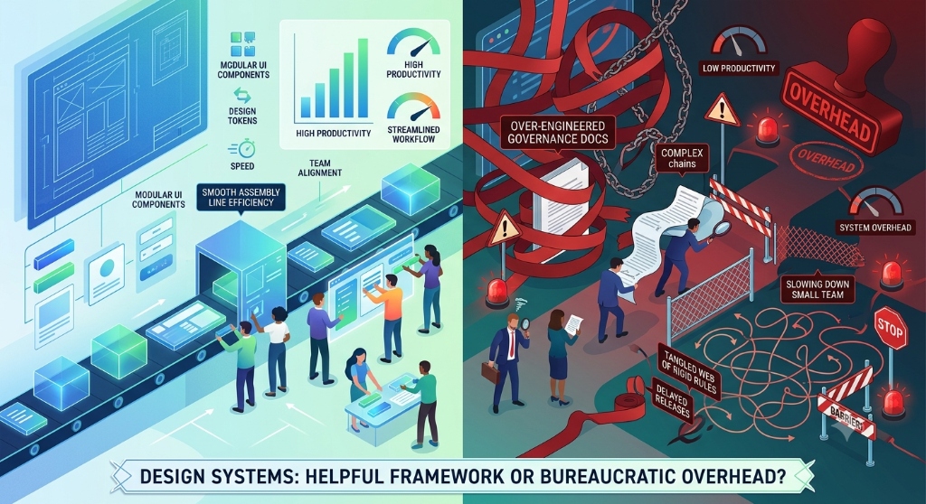
12. Signs Your Design System Is Becoming Overhead
A design system can start working against a team. Warning signs include:
- Components are created but rarely reused in practice.
- Documentation becomes harder to maintain than the components it describes.
- Teams can't ship simple changes without unnecessary process.
- Too many variants of the same component accumulate over time.
- Every requirement turns into a governance discussion rather than a design decision.
- Documentation goes outdated and no longer matches the implementation.
- Teams bypass the system and build custom solutions because it doesn't meet their needs.
These are signals to review the system's scope and maintenance model — not proof that design systems are inherently a problem. A system that's outgrown what the team can maintain usually needs to be scoped back, not abandoned.
Decision Framework
These questions can help gauge how much design-system investment a product actually needs:
- How many people contribute to the interface?
- How many products or platforms need shared patterns?
- How many UI patterns are repeated across the product?
- How often does the interface change?
- Are accessibility patterns being repeated inconsistently?
- Are designers and developers making the same decisions repeatedly?
- Is inconsistent UI creating ongoing maintenance problems?
- Will the product continue to grow and evolve?
- Is documentation currently missing or fragmented?
- Can the team realistically maintain a system after creating it?
Answers leaning toward more people, more repetition, and available maintenance capacity point toward a more formal system. Answers leaning toward fewer people, little repetition, and limited capacity point toward lighter shared foundations, or none for now. This is meant to guide judgment, not produce a score.
Practical Comparison Table
This is a practical decision framework, not a universal industry rule:
| Situation | Possible approach | Main consideration |
|---|---|---|
| Small one-off interface | Basic shared styles/components | Avoid unnecessary process |
| Early product | Lightweight foundations | Product direction may still change |
| Growing product | Reusable component library + documentation | Repeated patterns become valuable |
| Multiple teams/products | More formal design system | Shared standards and governance become more important |
| Mature system | Continuous maintenance and evolution | Prevent drift and unnecessary complexity |
Practical Design System Checklist
Sixteen practical steps for scoping and maintaining a design system appropriately:
- Define the problems the system should solve.
- Inventory existing UI patterns.
- Identify repeated components.
- Establish core design foundations.
- Define typography rules.
- Define color rules.
- Define spacing rules.
- Define reusable components.
- Document component states: default, hover, focus, disabled, error.
- Include accessibility guidance: keyboard, focus, labeling.
- Document usage guidance: when to use, when not to.
- Provide implementation examples.
- Define a change/review process.
- Remove unnecessary component variants.
- Keep design and code documentation aligned.
- Review the system regularly and expand it based on real product needs.
Common Design System Mistakes
- Building everything before validating reuse.
- Creating too many component variants instead of consolidating around common patterns.
- Confusing a component library with a complete design system.
- Ignoring accessibility in component design and documentation.
- Documenting components once and never updating them.
- Separating design and code ownership completely.
- Forcing every screen into a component that doesn't fit.
- Optimizing for consistency at the expense of user needs.
- Creating governance heavier than the product requires.