




The question usually shows up at the wrong moment: a product isn't performing the way a team hoped, and someone asks whether they need "better UX" or "better UI," as if the answer will tell them who to hire or what to fix. It's a reasonable instinct, because the two do point at different problems with different fixes — but the terms get used interchangeably so often that most people asking the question don't actually have a way to tell them apart in a specific, broken product. That diagnostic gap is more useful to close than another dictionary-style definition of either term.
The distinction that actually matters
The clearest version of this comes from Don Norman and Jakob Nielsen at the Nielsen Norman Group, who coined "user experience" in the first place and have spent decades refining what it does and doesn't cover. Their illustration is worth quoting directly: imagine a movie review website with a flawless interface for searching films — clean layout, obvious controls, no friction anywhere in the interaction. If that site's underlying database only contains major-studio releases, a user looking for a small independent film will have a poor experience no matter how well the interface performed, because the interface was never the thing that failed.
That's the real line: UI is the interface itself — the screens, controls, typography, spacing, and visual feedback a person interacts with directly. UX is everything that determines whether interacting with that interface actually gets someone what they came for — the underlying content, the logic of the flow, the information architecture, and the gap between what a product does and what a user expected it to do. A UI can be flawless and the UX can still fail, and the reverse is just as possible: a product with exactly the right features and flow, wrapped in an interface that looks amateurish enough that people don't trust it.
Two hypothetical products, two different diagnoses
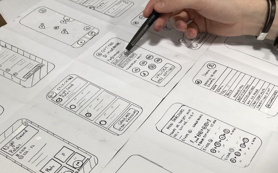
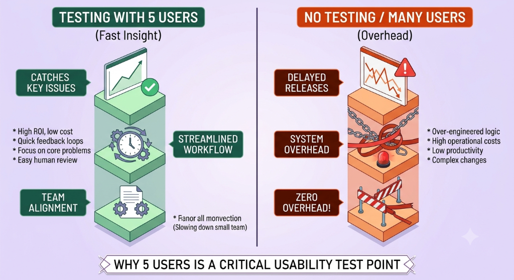
The following are hypothetical scenarios, not real projects. Imagine a scheduling tool where users can technically book an appointment in three taps, the buttons are legible, the color contrast passes every check, and visual QA finds nothing wrong — yet a large share of people who start booking never finish. If watching a handful of people attempt the task reveals that they get stuck because they can't find where to select a time zone, or the confirmation step doesn't make clear whether the booking actually went through, that's a UX failure: the flow and the information it communicates are the problem, not how any individual screen looks.
Now imagine a second, unrelated hypothetical: a project management tool where every workflow makes sense, the navigation matches how teams actually think about their work, and usability sessions turn up no real confusion — but new users describe it as "clunky" or "outdated," and trial signups drop off before anyone even reaches a task. Inconsistent spacing, a typographic hierarchy that doesn't guide the eye, and interactive elements that don't visually signal they're clickable can each undermine trust before the underlying logic gets a fair chance. That's a UI failure sitting on top of a sound UX.
The value of separating the two isn't philosophical — it changes where you look first. Fixing the second product's typography and button states won't help the first one's users find the time zone selector, and running more usability sessions on the first product's flow won't make the second one look more current.
Where the line gets genuinely blurry — including for the people who drew it
It's worth being honest that even the organizations most associated with defining these terms don't treat the boundary as rigid. Nielsen Norman Group's own foundational list of interface heuristics is titled "10 Usability Heuristics for User Interface Design" — usability and interface, in the same title — and their guidance on typography, contrast, and layout is published under the heading "5 Principles of Visual Design in UX", folding visual design into the UX label rather than isolating it. A misapplied visual hierarchy is simultaneously a UI defect (the element itself is designed wrong) and a UX defect (the user can't tell what to do next). Treating the categories as mutually exclusive is where a lot of the definitional arguments online go further than the actual practice does.
What this means for who you hire
Smaller teams and agencies often combine both under a single "UI/UX designer" title, and for a lot of projects that's a reasonable, cost-effective structure — the two disciplines benefit from being informed by each other, and a single person iterating on both at once can move faster than two people handing work back and forth. The risk is assuming the hybrid title guarantees hybrid strength. Design is a craft with genuinely different skill centers: some designers are considerably stronger at structuring flows and running research than at typography and visual composition, and the reverse is just as common. A portfolio full of polished screens tells you about UI ability; it tells you very little about whether that person can diagnose why a checkout flow is confusing.
For a larger product or a team that has already shipped something and is trying to figure out why it's underperforming, splitting the two — a researcher or UX-focused designer who can run and interpret usability sessions, and a visual/interaction designer who can execute a coherent interface system — tends to produce a clearer diagnosis than asking one generalist to be equally strong at both and equally objective about which one is currently failing.
The mistake worth naming directly
The most common failure pattern isn't hiring the wrong person — it's treating UX as a phase that happens before UI, handed off once and never revisited. Wireframes get approved, then a visual layer gets applied on top, and the flow itself never gets questioned again even after real usage data suggests it should be. UX isn't the rough draft that UI polishes; it's the ongoing question of whether the thing being polished is even the right thing, and that question doesn't close just because visual design started.
Further reading