


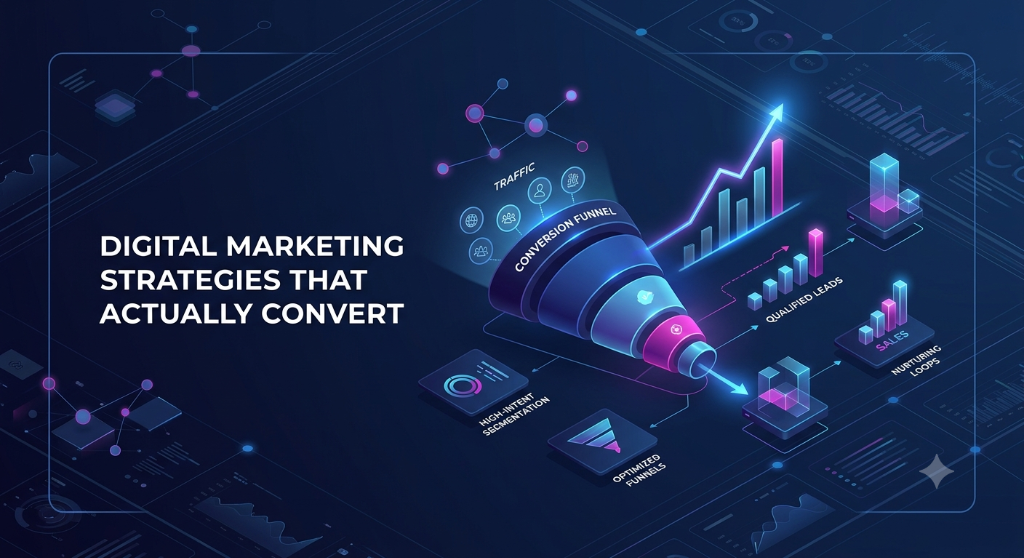

"Strategies that convert" usually gets answered with a list of tactics — retarget this audience, add urgency here, shorten that form — without addressing why a given visitor didn't convert in the first place. Tactics applied to the wrong cause tend to do nothing, or worse, they patch a symptom while leaving the actual reason someone left unaddressed. It's more useful to treat a failure to convert as one of three distinct problems, because each has a different fix and mixing them up is where most wasted effort comes from.
Problem one: the message and the visitor don't match
A visitor arrives with an expectation set by whatever got them there — a specific ad, a specific search query, a friend's recommendation — and the page they land on either continues that thought or breaks it. As a hypothetical example: an ad promising "20% off your first order" that lands on a generic homepage, rather than a page that leads with the discount and the product it applies to, forces the visitor to go re-find the thing they were promised. Some will do that work. Most won't, because the page just told them, implicitly, that it wasn't built for them specifically.
This is a different failure than a badly designed page — the page itself might be perfectly usable for a visitor who arrived some other way. It's a continuity failure between the promise and the destination, and it's most common when acquisition and landing-page ownership sit in different teams that don't review each other's work before a campaign goes live.
Problem two: friction the visitor didn't sign up for
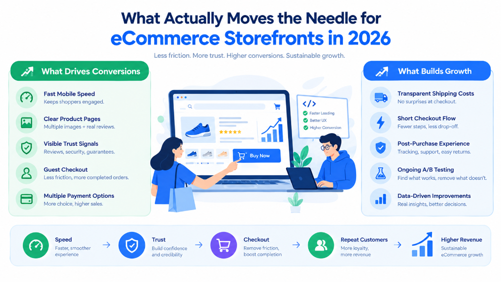
The second failure shows up once someone has decided they want what's being offered and still doesn't complete the action. The Baymard Institute's ongoing checkout research — one of the longest-running independent studies of ecommerce usability — has consistently found that a large share of abandonment at this stage isn't indecision, it's friction that shows up too late: costs that appear for the first time at the final step, account creation forced on someone who just wanted to buy once, or a form asking for information that doesn't obviously relate to completing the purchase.
The fix here isn't more persuasion — someone who's already decided doesn't need to be convinced again, they need the remaining steps to be as short and as predictable as the first one implied they'd be. Every additional required field, unexplained delay, or surprise cost is a fresh opportunity to reconsider a decision that was already made.
Problem three: the visitor doesn't trust the page enough to act
The third failure is quieter and harder to diagnose from analytics alone, because it doesn't leave the same kind of trace as a broken flow — someone just leaves, having decided, consciously or not, that the page isn't credible enough to hand over money or personal information. Nielsen Norman Group's research on web trustworthiness points to a small, stable set of signals people rely on: whether the design looks current and cared-for, whether pricing and terms are disclosed upfront rather than surfaced later, and whether the site provides real, verifiable information about who's behind it rather than just a polished storefront.
None of that is exotic, but it's easy to underinvest in because it doesn't map to a single fixable bug — it's the cumulative effect of a dozen small decisions, most of which look fine in isolation. A missing physical address, an unclear return policy, or stock photography that doesn't match the actual product each cost a little credibility, and credibility is spent before a visitor ever reaches a form.
Where manufactured urgency backfires
Countdown timers and "only 2 left" messages that don't reflect anything real are a common shortcut for problem three, and they're increasingly a legal and reputational risk, not just a stylistic choice. The FTC's 2022 staff report on dark patterns specifically calls out fabricated scarcity and urgency claims as a manipulative interface practice the agency treats as a potential unfair or deceptive trade practice under the FTC Act. Even setting the regulatory exposure aside, a visitor who notices the countdown timer resets on page refresh doesn't just distrust that one claim — they discount every other trust signal on the page along with it. Real urgency (an actual limited batch, an actual deadline) works because it's true; fabricated urgency works once, on people who don't check, and actively damages the brand with everyone who does.
A mistake worth naming: optimizing the easiest metric to move
A page redesign, a new headline, or a discount code are all easy to test and quick to show a lift in a dashboard, which is exactly why they get reached for first — regardless of whether the actual problem was message mismatch, friction, or trust. The harder, more valuable habit is figuring out which of the three is actually responsible before touching anything, usually by watching a small number of real sessions or reading the actual drop-off point in the funnel rather than starting from the page that's easiest to edit. A form that's clean, fast, and trustworthy still won't convert a visitor who arrived expecting something the page never delivers — and no amount of button-color testing fixes that.
It's also worth being precise about what "converts" means for a given page before optimizing for it. A newsletter signup, a demo request, and a completed purchase are all conversions in the loosest sense, but they sit at different points of commitment and respond to different interventions — a tactic that lifts email signups by lowering the bar to enter an email address can just as easily lower the quality of who's on that list, which shows up as a worse problem two steps later. Treating every conversion metric as interchangeable is how a genuinely improved dashboard number can coexist with a business that isn't actually growing.
Further reading